
Places & Spaces
A brand or design truly comes alive when it enters and transforms the environments where we live, work, and play.

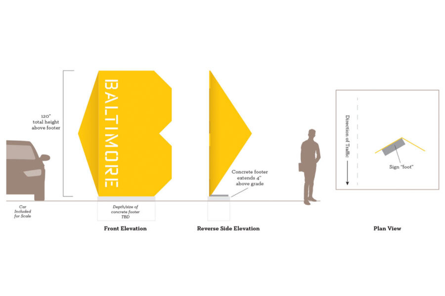
Baltimore Gateway Signs
In 2015 Post Typography submitted this winning proposal in a national design competition for new Baltimore City welcome signage. This unbuilt project goes beyond signage to conceive a flexible graphic identity system that includes wayfinding, sculptural forms, and beyond.
Inspiration came from Baltimore’s city seal, its fierce neighborhood pride, and its friendly, unpretentious spirit.


A Multifaceted Symbol
We joined the letter B with a forward-pointing triangle to form a shape that suggests a heart, a placemarker, and an arrow. The angular lines and warm color come from the Baltimore city flag and the geographic border of the city itself.
An iconic family
5 variations on the B/Heart were designed to adapt to multiple locales with with widely varying conditions. Variety also encourages locals to seek out and experience each sign.

Proposed for major roadways crossing the city line, these designs would replace Baltimore’s old, rusty, and inconsistent signage.

When drivers entering the city pass by one of these 18-foot signs, the different symbols are revealed. From a distance the “B” and “Baltimore” are clearly visible. As they continue the heart becomes more prominent, with the final view being the arrow pointing into the city.

Hundreds of distinct communities make up this “city of neighborhoods.” Each one gets a shout-out in these laser cut stainless steel panels. The typographic pattern adds an extra level of visual detailing for pedestrians as well as motorists.


We envisioned a comprehensive system that extends to placemaking applications, sculptural bus stop benches, bike racks, and even downtown wayfinding signage.

The iconic design and flexibility suggest the beginning of a new brand for the City of Baltimore.

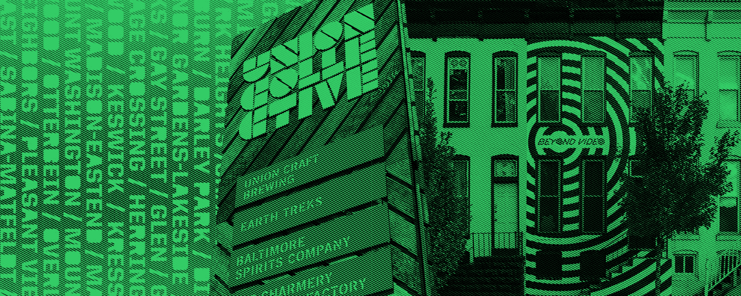
Union Collective
When Union Craft Brewing outgrew their original facility, they moved into a space large enough to bring a community of friends with them. The former Sears distribution warehouse was now home to the brewery plus a growing list of their peers in food and spirits. Oh, and a bouldering gym. And a maker space.
The branding had a lot of work to do. Could it reflect the bold spirit of this new endeavor, enliven the spare industrial building, and cohesively contain the wide range of tenant brands?
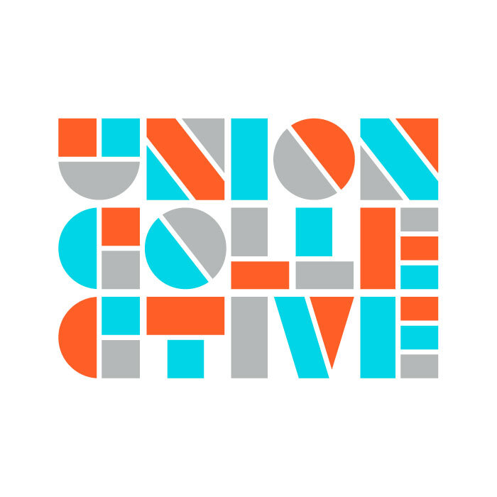


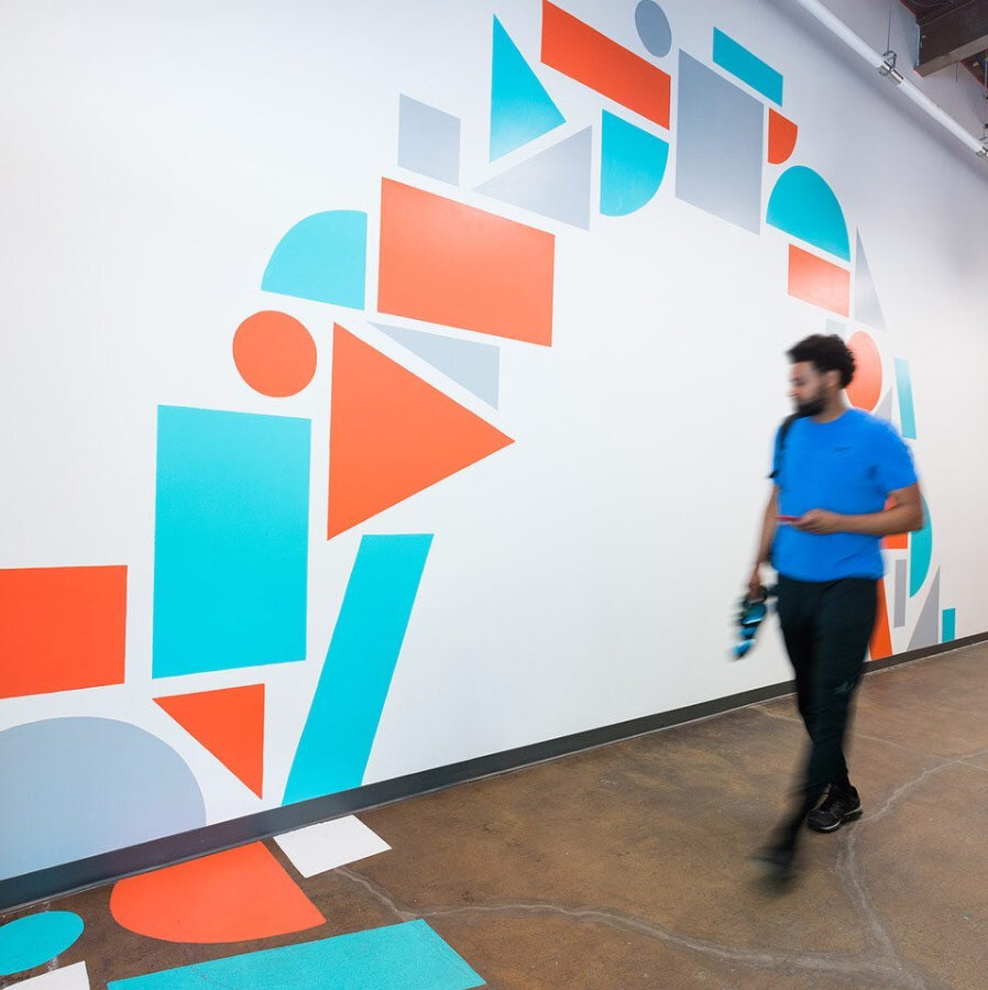


Made with the team at Post Typography
More on Union Collective coming soon…
Beyond Video
A little goes a long way in the branding and facade for this 21st century video store.


Made with the team at Post Typography