Greenbuild International Conference & Expo
For a decade, our team at Post Typography shaped the most important annual event in the sustainable building industry. I led or co-led the development of Greenbuild’s branding each year, building off of a kernel of a theme supplied by the client. Some years the focus was on the place, other years on emerging technology, and other years on the big ideas that inspire a movement.
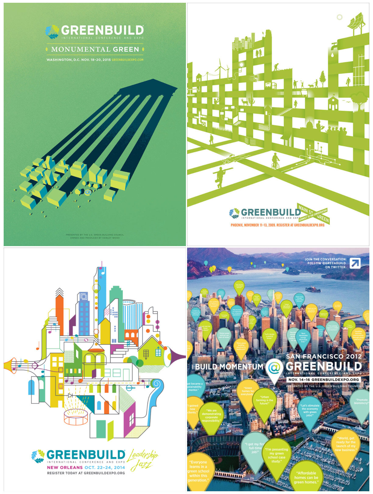
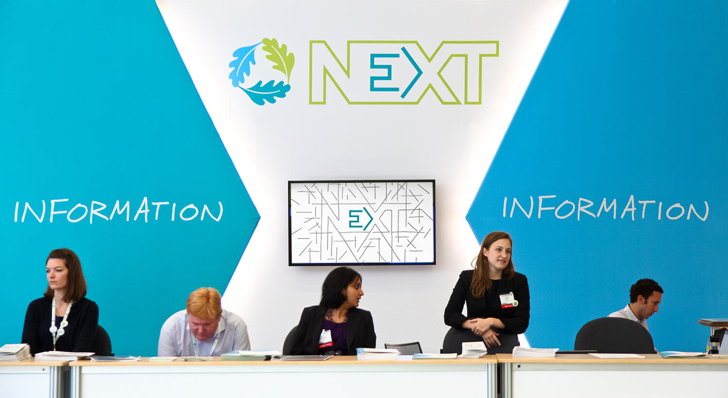
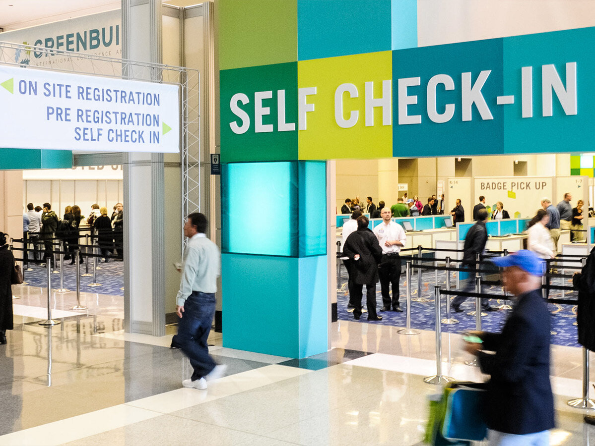
The annual designs debuted as print ads in major trade publications, sometimes evolving as a series. Throughout the year it expanded into web ads and finally into on-site displays and collateral, screen displays, animations, and more.
We constructed our brand design for Greenbuild 2010 from colorful cubes that suggest structures and building blocks. A series of eye-catching illustrations express the convergence of the green building movement at Greenbuild.


In 2010 we provided conceptual direction for the vendors creating the event’s booths and structures, and simultaneously designed some of the smallest bits of collateral and merch, ensuring a cohesive brand experience whether checking in at the hotel, getting information on site, or watching keynote speakers.


Over several months, we worked with a vendor to develop a custom square bag made of sustainable fabric, that was cut and sewn in multiple colorways to extend the visual theme of the cubes into the real world.

The 2013 conference theme of “Greenbuild Nation” was meant to unite a diverse range of sustainability stakeholders with a common purpose.
Inspired by host city Philadelphia’s revolutionary history, we created a campaign based around uncompromising, manifesto-like statements.


I co-wrote the copy and then created all of the hand lettering for the campaign. Such an organic, human, and bold look stood out in the context of building trade publications, especially back in 2013 before hand lettering was de rigueur.

From entire walls of hand lettering at the convention center down to program covers and collateral, a human touch and a palette that avoided the green trap energized the entire event.

In our time working with Greenbuild, the conference and expo drew a quarter million attendees and exhibitors to 11 North American cities.
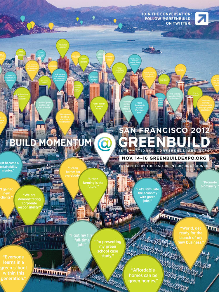
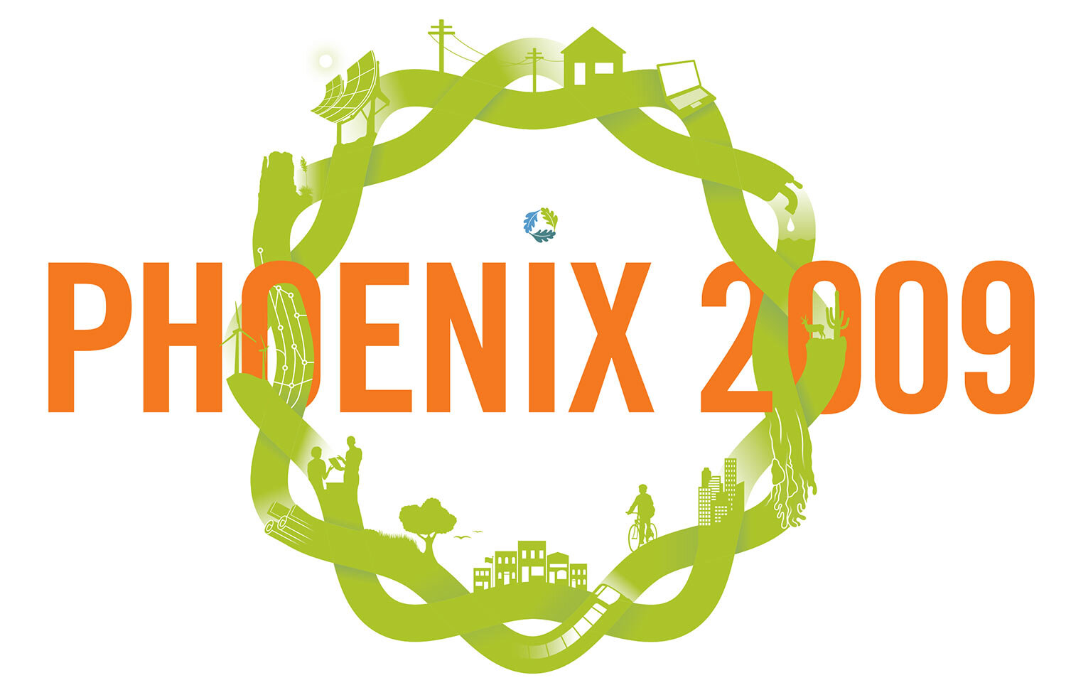
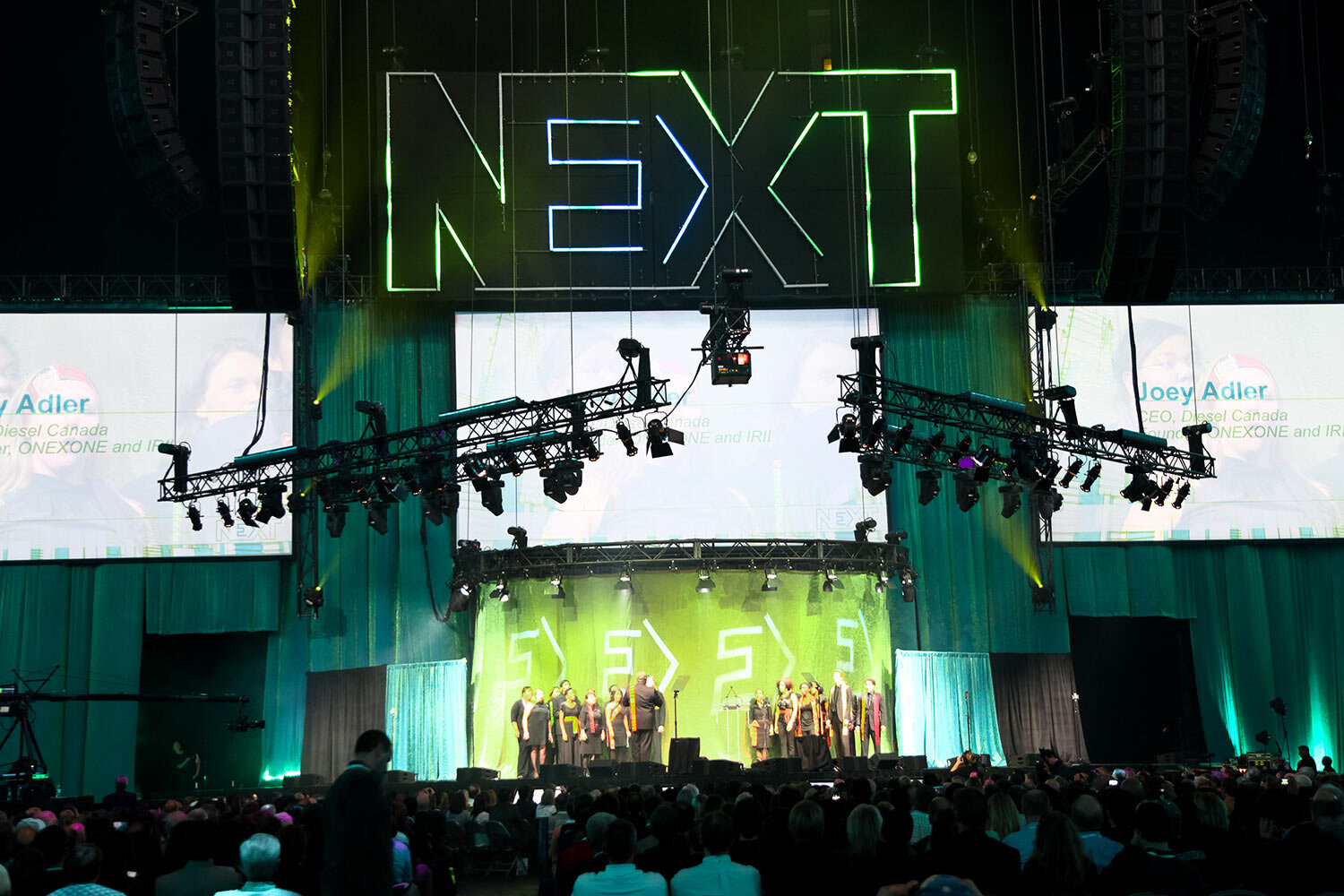
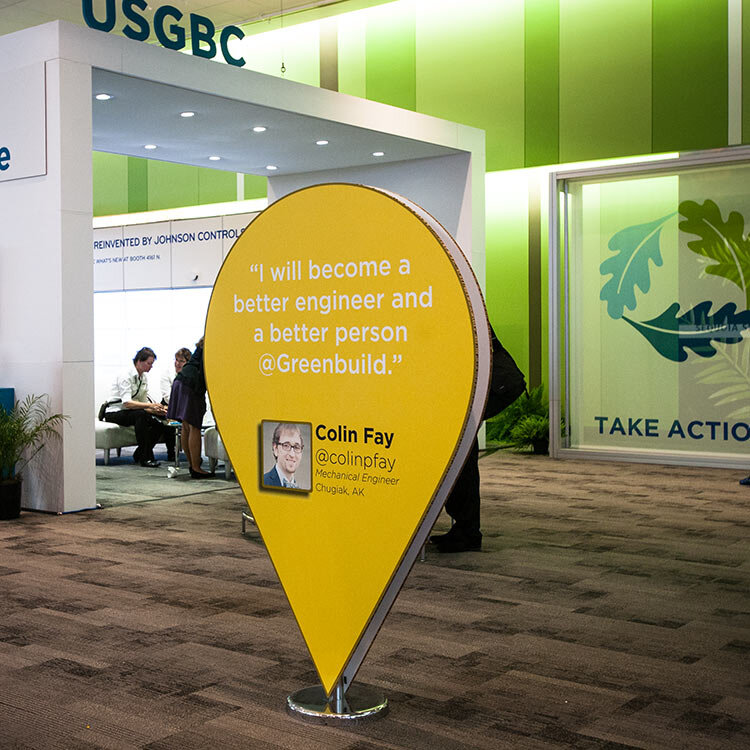
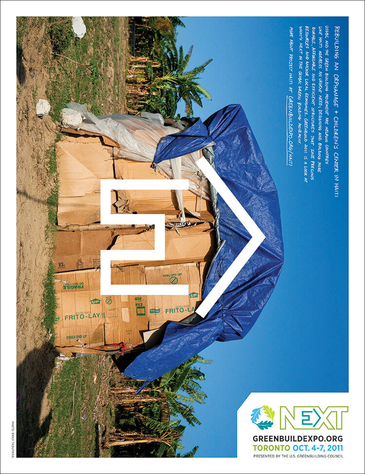
Below, a few more moments from over the years.