Future Islands
I’ve designed records, merchandise, posters, and more for Future Islands since long before Letterman. We became friends from sharing stages and sleeping on the same hard floors on tour, and I’m proud to continue a creative relationship with them today.


“ALAYA”
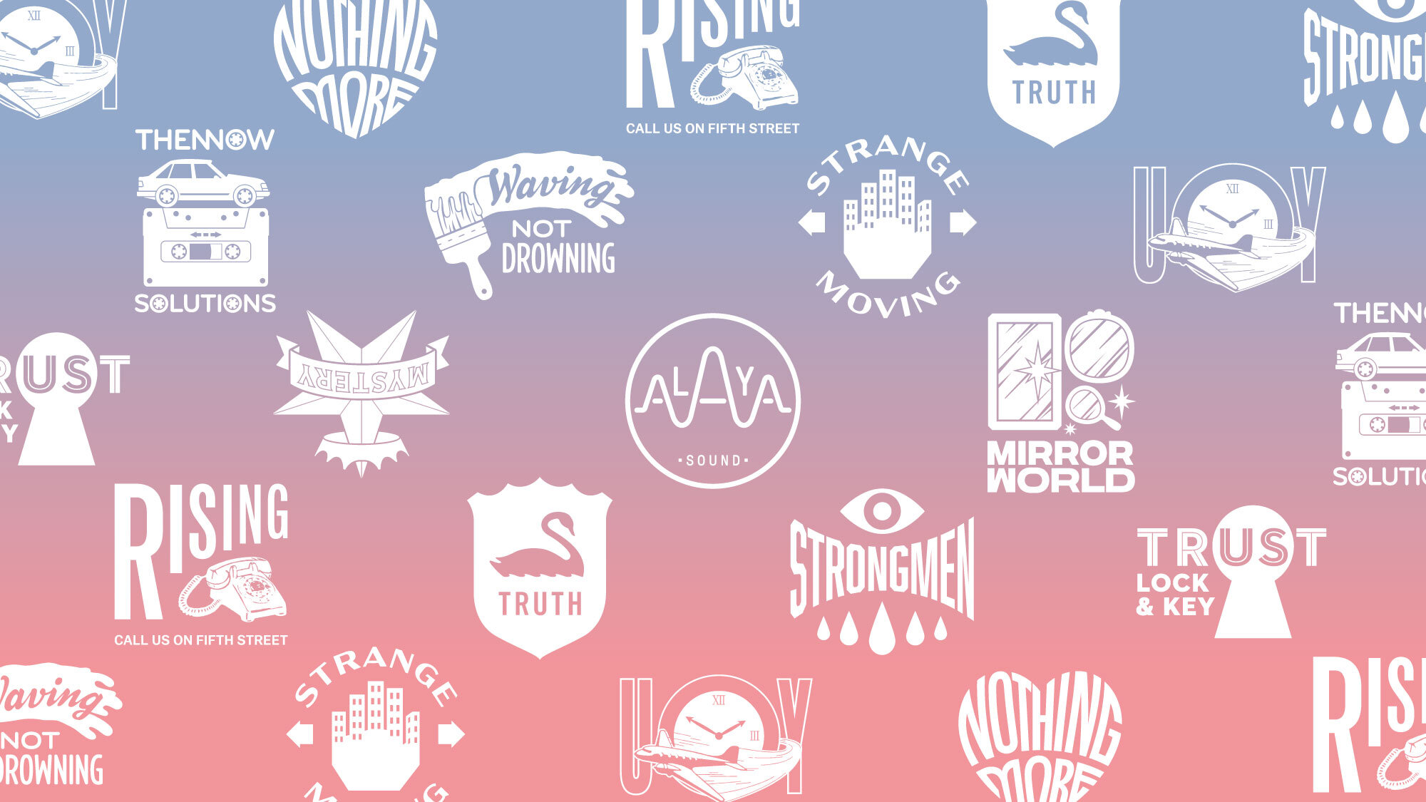
The band asked me to design a suite of merch to coincide with the release of their latest album, As Long As You Are. The only direction they gave was that it needed to have “some sick Nolen lettering.”
Inspired by recurring lyrical themes of water and transformation, the band’s name is drawn in 4 distinct lettering styles, shifting under ripples and roiling distortions.
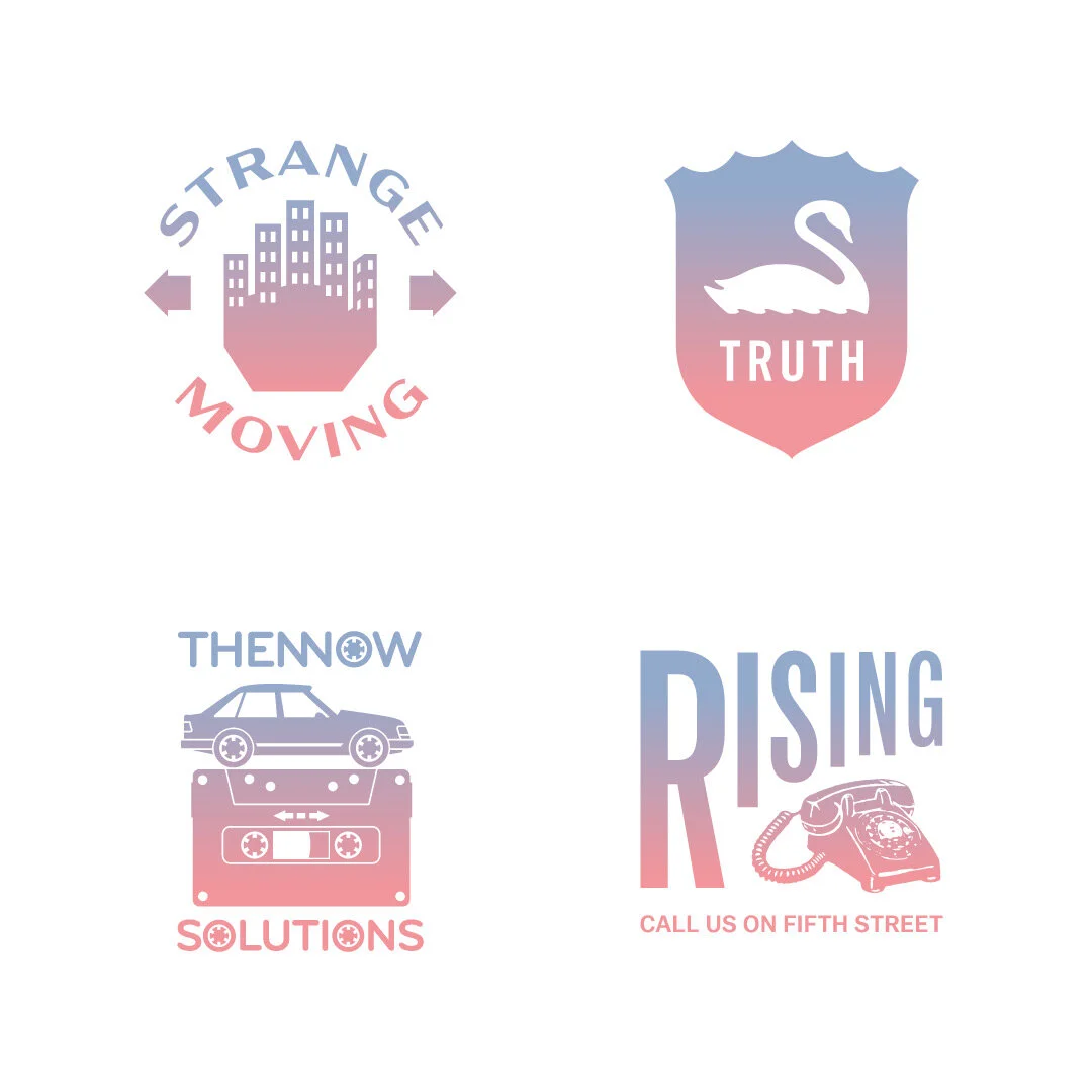

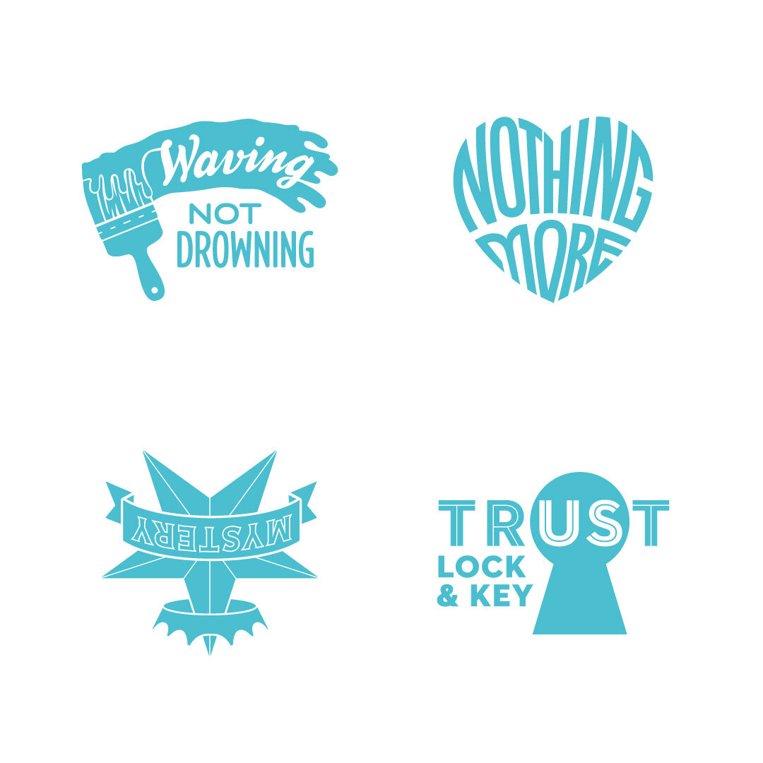
I also created one emblem for each song. Visually inspired by old logos and ads, the text and imagery in each references lyrics or themes, not song titles, to give fans something to decipher and decode after hearing the album.


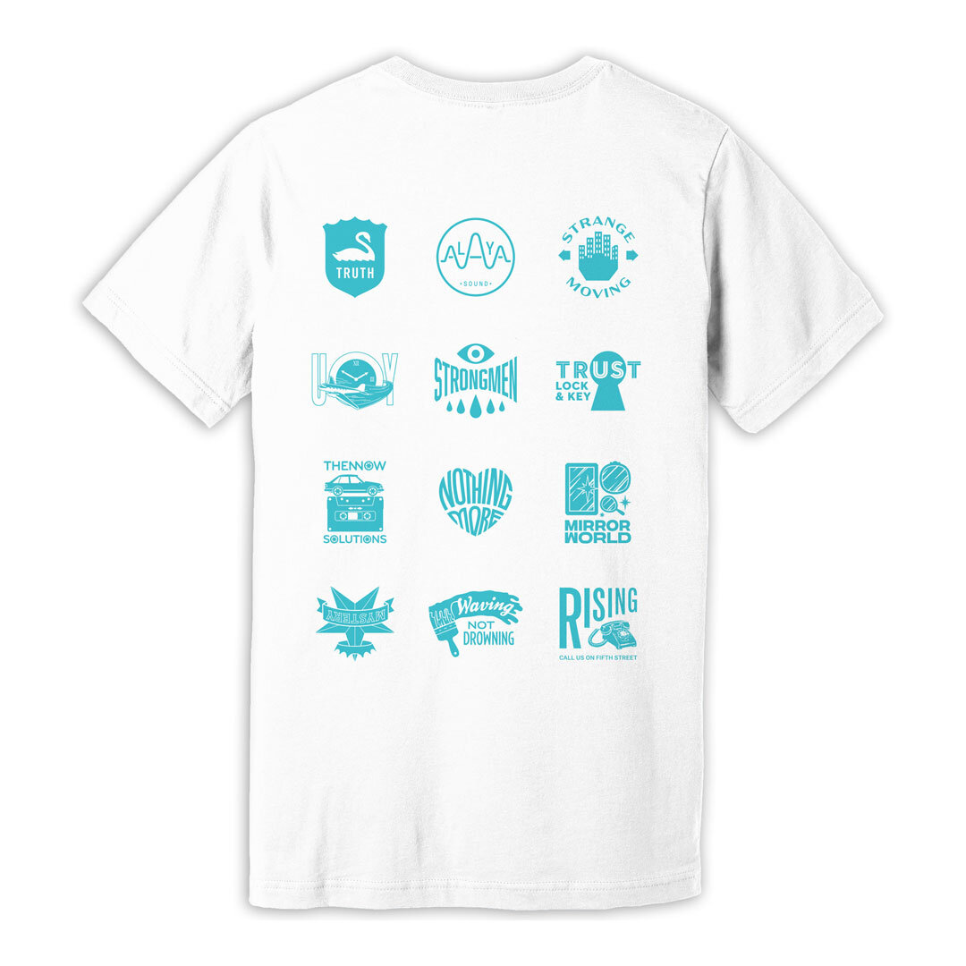


Originally intended as one T-shirt, the design proved so popular that it was printed in 4 colorways (one per band member) and remixed for hoodies, jackets, a tote, and turntable slipmat.

Kids don’t necessarily look good in designs that mimic regular band merch. So for this toddler tee I wrote the line “I taught Future Islands how to dance!” as a cute reference to frontman Sam Herring’s famous footwork.


The band wanted something that emphasized the album release show would be a streaming-only event. An isometric grid represents a network, holds billboards of information, and is transformed into volumetric spaces by splashes of color. The flat cubes are filled with gestural figures—the fans across the globe dancing together but apart in their separate homes.

This massive 12” circular sticker was distributed to indie record stores, doing double duty as promotion for the album As Long As You Are and serving as a reminder to shop in a socially-distanced manner. The styling echoes the song emblems from the merchandise.
On the Road Again
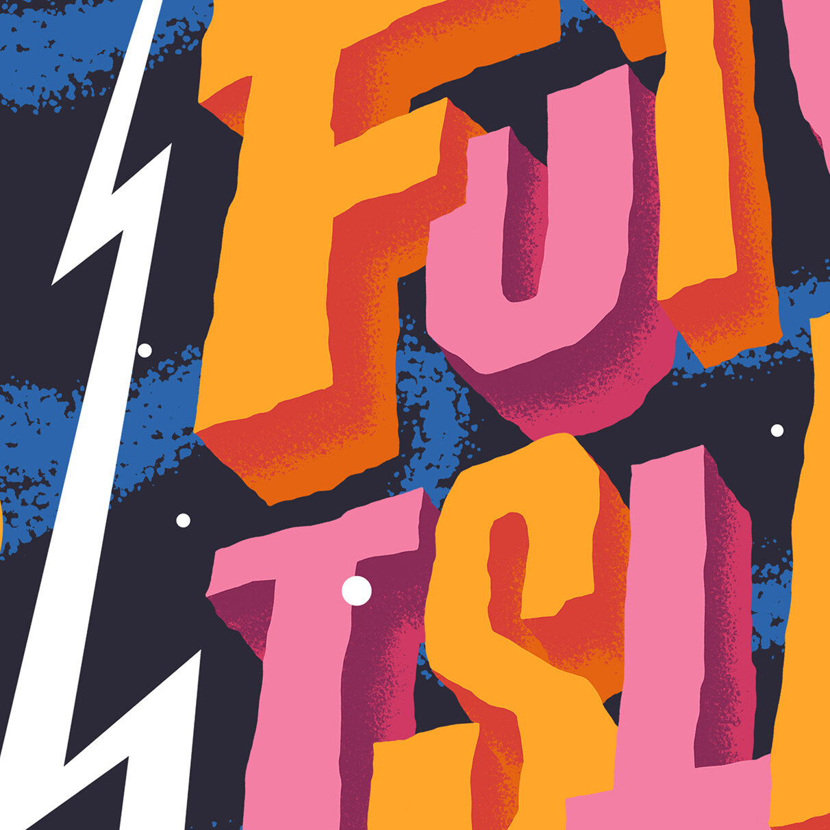
As the world begins to open up again, the band reached out for a design to promote their upcoming tours of the US, UK, and the EU. They asked for a few concepts including one in outer space. The final design harkens back to the era when space fantasies filled movie matinees, comic books, and pulpy magazines. I posted some process images on Instagram.


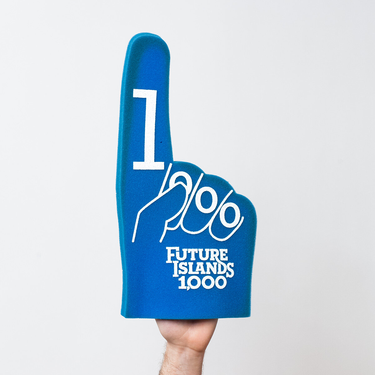
Future Islands 1,000
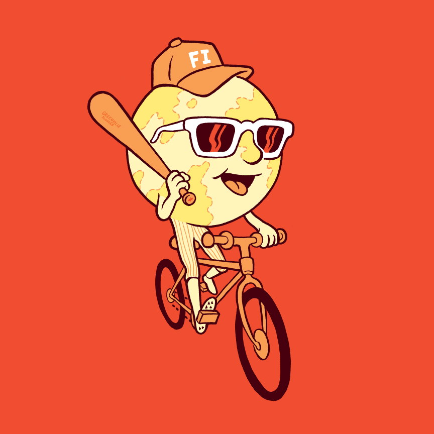
Post Typography was asked to create the branding for Future Islands’ 1,000th show. The merchandise and styling of the globe character (updated from existing merchandise) was a nod to the originally-planned venue for this event that drew fans from around the country.


Thrill Jockey Records
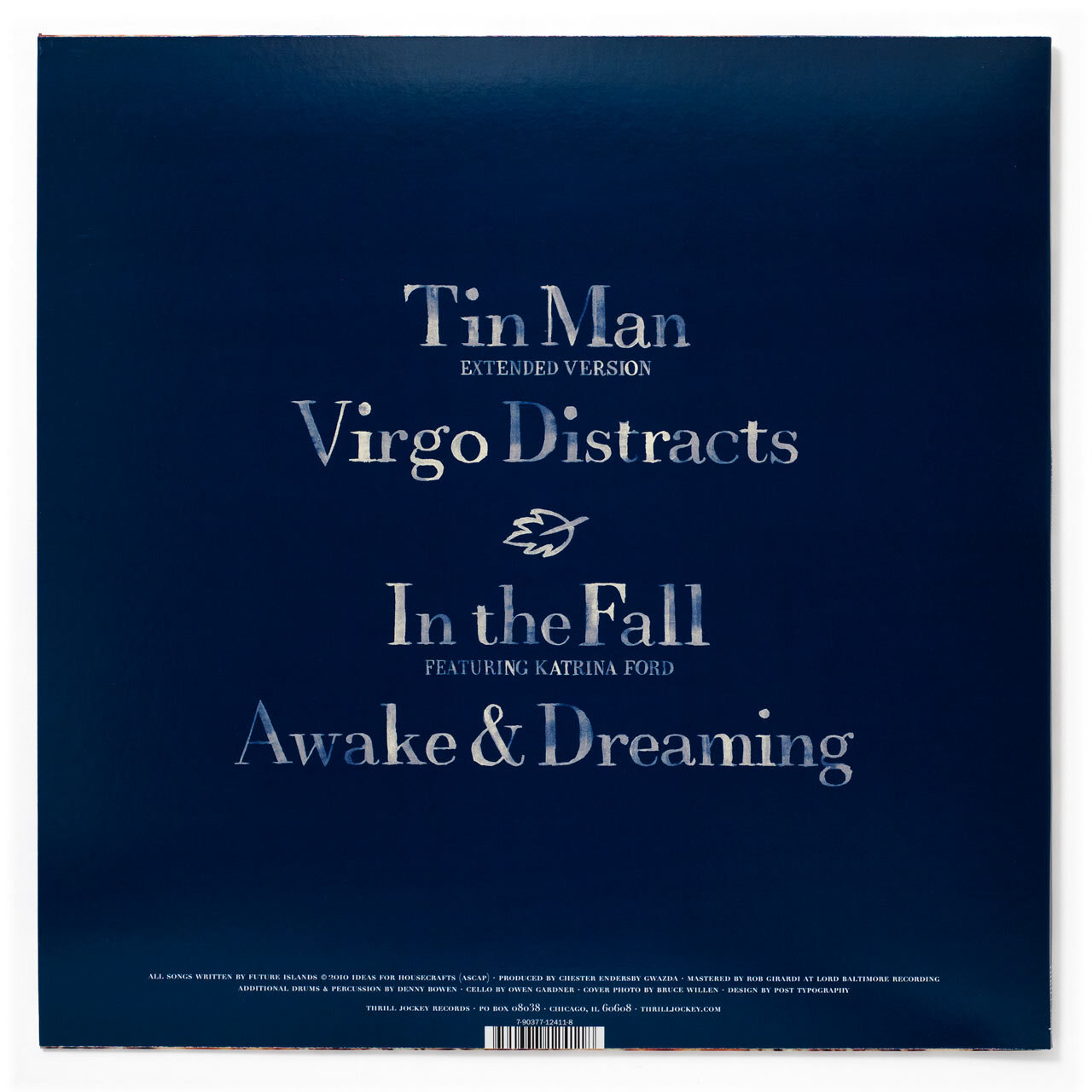
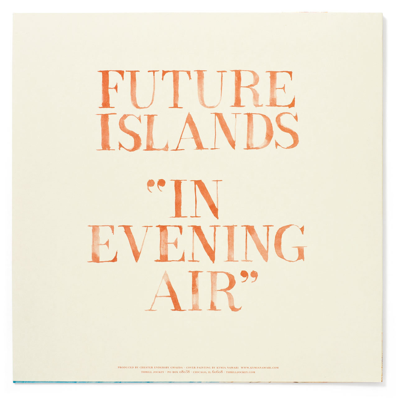
Back when the band was on the legendary indie label Thrill Jockey, they tapped Post Typography to design several of their releases. I created all of the ink wash lettering seen here.